How to style your React App using Emotion CSS, Best for Beginners

Nowadays, CSS-in-JS is a hot topic. There are many popular libraries out there like styled-components, JSS, Emotion, etc. Using CSS-in-JS library in your applications is excellent because you won’t have to maintain multiple CSS files, you will write the styles in the same components, which can also make naming the class names easier. Plus, you can use JS in your styles, add conditions, variables, and more.
Today, you will learn how to get started with Emotion, install Emotion in your React app and write your very first styles for your components using Emotion CSS.
Prerequisites
You should have a basic knowledge of React and CSS to follow along.
Let's get started!
React app setup
First, create your starter React app.
npx create-react-app emotion
After installation, you will need to build a couple of components where we can add styles after we install Emotion.
I suggest you clone this repo I used in this blog for demonstration. Or you can also create or use your own components and follow the instructions.
Installing Emotion
Now that your app has some components let’s install Emotion in our react app.
npm i @emotion/react @emotion/styled
Since we use emotion on our React app, we installed the package with @emotion/react and @emotion/styled for styled components, which we will mainly learn.
The @emotion/react package also gives us the css Prop, which you can also use to style your app by adding inline styles using the css={} prop. But let's look at styled components.
Emotion 'styled' component
Emotion styled is similar to styled-components. You can create components with css attached to them, so it will carry over the styles whenever you render the component to any other application page.
Let’s create a styled Button component using emotion.
First, go into the Button.js or build your own.
const Button = ({ name }) => {
  return <div>{name}</div>;
};

export default Button;
The {name} is the prop we will pass when we render this component.
Now, let's import styled from emotion CSS. On top of your page, add import styled from '@emotion/styled';.
Since our component is named <Button />, you can name your styled component StyledButton, which we will render inside our button component. Something like below:
import styled from '@emotion/styled';

const StyledButton = styled.button`
  padding: 6px 12px;
  font-size: 24px;
  border: 1.5px solid green;
  border-radius: 6px;
  background-color: white;
  color: green;
`;

const Button = ({ name }) => {
  return <StyledButton>{name}</StyledButton>;
};

export default Button;
Here, const StyledButton = styled.button is how you create a component; inside the backticks, you define your styles. After you create your component, you can simply render it inside your parent component as,
<StyledButton>{name}</StyledButton>;
You can create multiple styled components in the same file and render them as you like. Next, I will show you how to access the prop inside your styled component.
Style component based on props
In the Button component above, we passed a button name as props ({name}). Now let us add another prop called isPrimary, that will refer to the button type, like the primary or secondary button, which may have different styles.
import React from 'react';
import styled from '@emotion/styled';

const StyledButton = styled.button`
  padding: 6px 12px;
  font-size: 16px;
  border: ${(props) => (props.isPrimary ? '1.5px solid green' : '0')};
  border-radius: 6px;
  background-color: white;
  color: ${(props) => (props.isPrimary ? 'green' : 'red')};
`;

const Button = ({ name, isPrimary }) => {
  return <StyledButton isPrimary={isPrimary}>{name}</StyledButton>;
};

export default Button;
We added the isPrimary prop ({name, isPrimary}) and then passed it into our button <StyledButton isPrimary={isPrimary}>{name}</StyledButton>;.
Up, in our StyledButton, we can access the passed props as ${(props) => (props.isPrimary)}. isPrimary will be a boolean when we render a button component, for example <Button name='Click Me' isPrimary={true} />.
So, we check if it is true or false and set our styles according to it.
If you want to add hover styles to your button, it is easy. You can add it inside the same styles by nesting &:hover {},
//Button.js
  color: ${(props) => (props.isPrimary ? 'green' : 'red')};
  &:hover {
    color: black;
  }
`;
We will render our Button in this next component.
Modal Component
Now that we know how to create a styled component using Emotion, let’s build a modal that includes the <Button /> component.
In the Modal.js,
const Modal = () => {
  return (
    <div>
      <h2>Are you enjoying learning Emotion CSS?</h2>
      <div>
        <button>No</button>
        <button>Yes, I love it!</button>
      </div>
    </div>
  );
};
We will create a styled component called Card which can be a wrapper to our contents.
//Modal.js
import styled from '@emotion/styled';

const Card = styled.div`
  width: 500px;
  padding: 32px;
  margin: 100px auto;
  box-shadow: 0 4px 8px 0 rgba(0, 0, 0, 0.2);
  transition: 0.3s;
  &:hover {
    box-shadow: 0 8px 16px 0 rgba(0, 0, 0, 0.2);
  }
`;
Let's create one component for the modal title, Title, for our h2.
const Title = styled.h2`
  font-size: 24px;
  font-weight: 400;
`;
One last component - Container, where we will add our buttons.
const Container = styled.div`
  margin-top: 25px;
  display: flex;
  justify-content: space-evenly;
  align-items: center;
`;
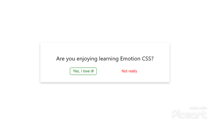
Once you create these components, we will replace the HTML elements that are inside our Modal with the new components. So, first <div> will be <Card>, <h2> will be <Title>, the <div> after the <h2>will be<Container>, and inside there we will import our <Button /> and pass in the props.
const Modal = () => {
  return (
    <Card>
      <Title>Are you enjoying learning Emotion CSS?</Title>
      <Container>
        <Button name='Yes, I am loving it!' isPrimary={true} />
        <Button name='Not really' isPrimary={false} />
      </Container>
    </Card>
  );
};
After this, if you render your <Modal /> in your App.js, it will look like below.
Conclusion
Well done! You just learned to create styled components using Emotion. It is the intro to Emotion CSS, and you can do other cool stuff in your app using emotion.
Thank you for reading this blog. I hope it helped you to learn more about emotion CSS and the concept of CSS-in-JS.